Salmon 9 Family
Salmon 1.1 update: a Dutch can of worms
From the beginning I wanted Salmon to support as many languages in Latin script as possible, but chose to not include many because I was not familiar with some characters they use. A few weeks ago the list of fixes was long enough for a new release, when I decided to do some quick research about the Dutch IJ and ij characters. It won't take long, I said to myself, it's just two additional glyphs…
Opening the lid
Aren't these characters just an "i" and a "j" mashed together? They can be, but first, where do they come from? It seems the historical spelling used to be "ıı" (two dotless "i") in the Middle Ages, then the second "ı" was elongated to avoid confusion with "u", then eventually dots were added.
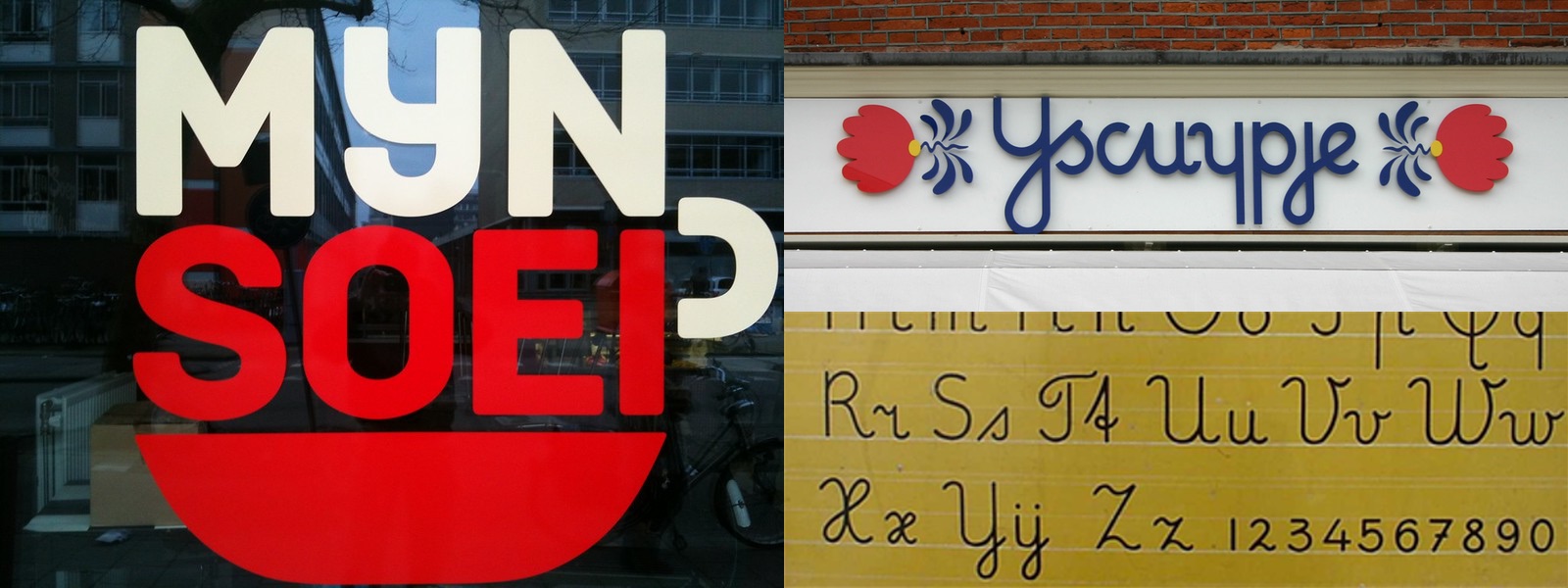
"ij" in lowercase handwritten text can look like a "y with dots". And as Dutch initially didn't use the letter "y", "ij" is often considered the 25th letter of the alphabet. Except modern Dutch has many loanwords with a "y", in particular borrowed from Latin, like systeem, so they both coexist.
It also creates all kinds of sorting issues: if "ij" replaces "y", in a phone book do you list names beginning with "ij" under "i" or "y"? For the sake of your sanity I will not dive deeper than "it depends" here :)
And this is just the tip of the iceberg. Think about the radio alphabet, word games, Braille, abbreviations…
Fun bit of trivia: Afrikaans, a language spoken in South Africa, evolved from Dutch before it became a distinct language. In Afrikaans "ij" was entirely replaced by "y". This is the reason why some names of Dutch origin can have multiple spellings: Snijder → Snyder, Cruijff → Cruyff, Dijkstra → Dykstra…
A squirming mess
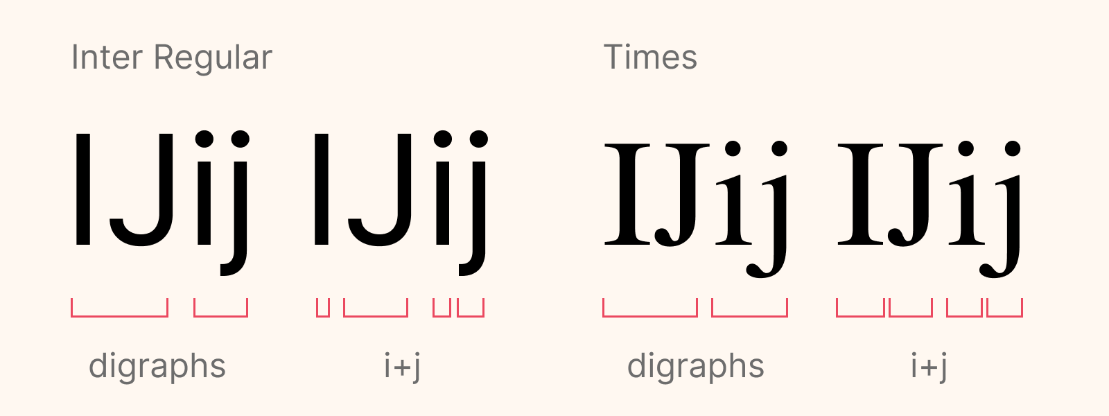
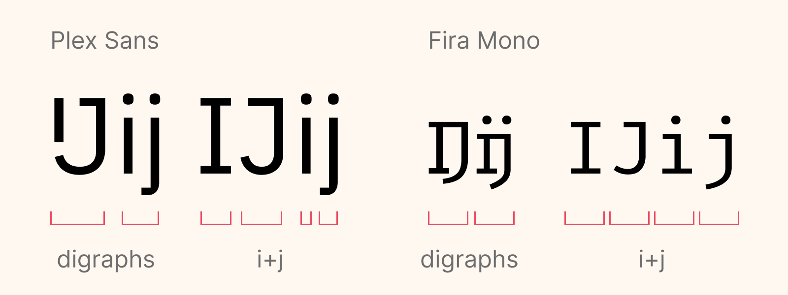
Now that we know how "IJ" and "ij" came to existence, how do we draw them? Are they ligatures like "Œ" and "œ"? No because the "i" and "j" are not connected. They are digraphs, pairs of characters that represent a single phoneme.
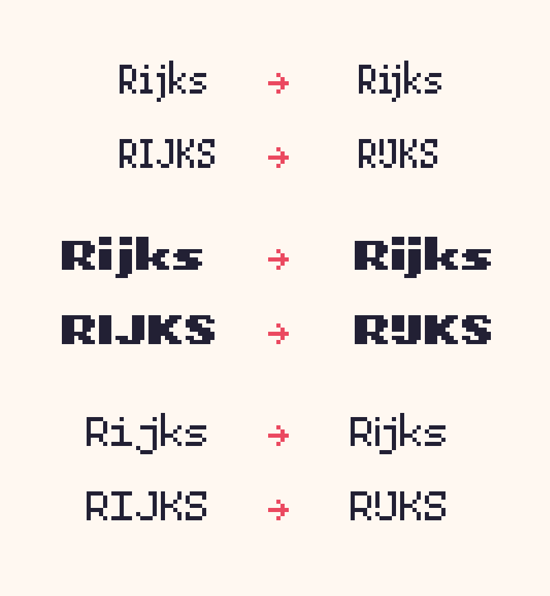
If a word begins with it, both parts of the digraph must be capitalized. "IJsbreker" is correct, while "Ijsbreker" is not only incorrect but also less legible for Dutch readers. Because you see, there are words with "ij" as separate letters, with a different pronunciation. While "ij" is pronounced ɛi ("ey" a bit like in the word "late"), while "ij" is sometimes pronounced ə ("lelijk" is pronounced a bit like "lay-luck").
Of course when you set text vertically both parts of the digraph preferably remain together, as with ligatures.

Wriggly details
So what is the big deal? you might think. Just cram an "I" and a "J" together and call it a day. And you would be right for a couple reasons. First, most of the time the Dutch themselves can't be bothered and just type "i" + "j". They only use the dedicated characters in more formal contexts or when typography is really important, like for a poster or a logo. Secondly, when these glyphs are available in typefaces they often look exactly the same as regular "I" and "J".
However, a proper glyph is more legible for native Dutch readers, and usually looks much nicer. Typography being a living thing, I don't think there is an official way to write or draw these glyphs. Many variations can be seen in typefaces, on signs, or in print.
The most common way to draw the glyph in uppercase is a short "I" above the leg of the "J".
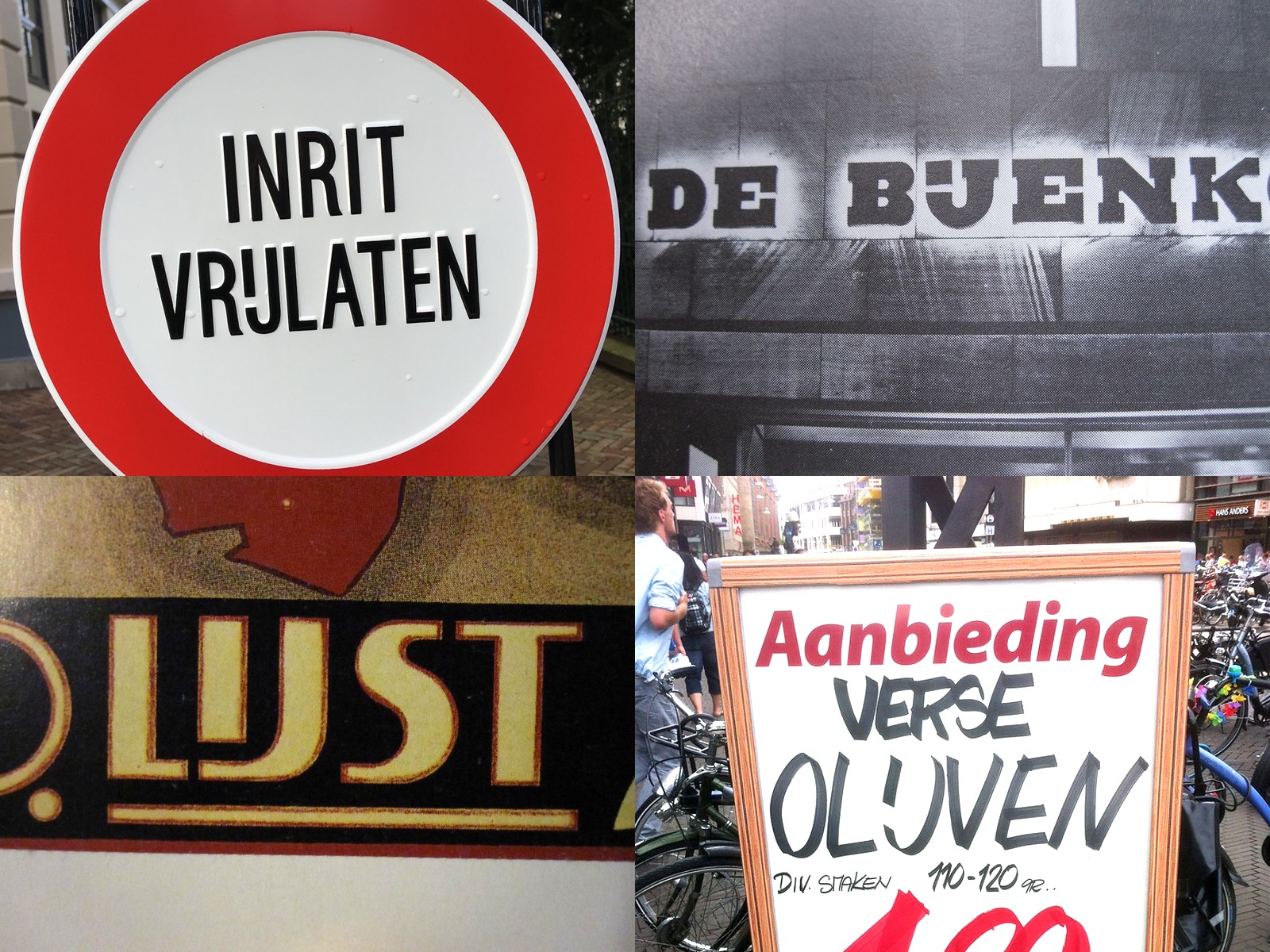
Others are mostly older, historical designs.

In lowercase the proper glyph is still commonly just "i" and "j" and looks just like the regulars letters, in a single glyph. Monospaced typefaces are a notable exception because glyph width is constrained.
Sometimes it looks like a "y" (or even "ÿ", with diaeresis), to mimic the handwritten letter learned in schools.
Unicode induced stress
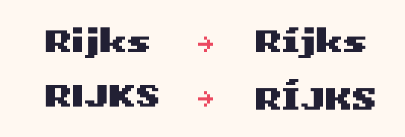
If that wasn't complicated enough, in Dutch stress can be added to vowels with an acute accents. In case of double-vowels or digraphs, an accent is put on both letters: een → één. It is the same for "IJ" and "ij" (yes, in Dutch they are considered double vowels as they represent a single phoneme). The problem is that to this day there is no unicode character for "ij" or even "j" with acute accents. Ironically, decades ago typewriters offered a dedicated character!
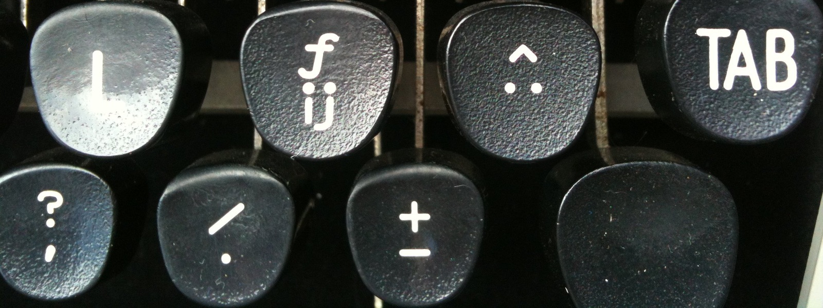
Unless a type designer jumps through hoops in his typeface to add a sequence like "acute accent" + "i" + "acute accent" + "j", we have no way to type such characters.
Even the official source for spelling of the Dutch language states that due to the difficulty of putting an accent on "j" on computers, the second accent can be left out. Then only the "i" is accented: e.g., wíjten.
Lex pixelis
Phew… That was a lot of information! Now, how can I make use of this in my typefaces?
Stylistically, I chose to stick to the most common designs in actual use in the Netherlands and Belgium nowadays, as I want Salmon to be usable in many contexts. The new glyphs follow the style of each individual font in the family, they are all slightly different!
Technically, with the simple tools I use to create the fonts, the only way to use these glyphs is through their unicode character. U+0132 for uppercase, U+0133 for lowercase. I didn't have any way to add stress to the digraphs anyway, so I was forced to keep things simple (which spared me another rabbit hole).
As a result you can follow this super simple rule:
- For the nicer digraphs, use the unicode characters (or copy/paste them from the glyphs list that comes with every Salmon release).
- Otherwise, just use the regular "I+J" or "i+j".
If you really need to add stress, you will have to use accented "Í/í" plus a regular 'j'.
Salmon now supports 140 languages! \o/
I probably made many mistakes and omissions above, I hope my Dutch friends will forgive me. My goal was not to write a reference on this topic, but simply to showcase some of the diversity in languages and typography.
Pictures from this great Flickr "IJ & ij" group, and Wikipedia.
CHANGELOG
V1.1 - 08/05/2022
Changes:
- Added IJ and ij glyphs for Dutch language support
Fixes:
- "£" too wide in Salmon Duo Regular
- "/" cut in half in Salmon Sans Regular
- "~" (U+007E) placed too high in all fonts
- Kerning between iìíîï and F, J, too wide in Salmon Sans
- Kerning between iìíîï and j, t, too wide in Salmon Narrow
- Kerning between P and J too wide in Salmon Narrow
- J off by 1 pixel in Salmon Narrow regular
Leave a comment
Log in with itch.io to leave a comment.